OneDrive links now go right to light box view
Storing images for pictures in blog posts in OneDrive makes it easy to link back to the source album. In my blogs Gallery Ludwig and Silver Canvas I have been doing that for many years. Microsoft has made a lot of changes in that time. The Microsoft “cloud” depository started with Live Spaces, became SkyDrive and more recently OneDrive. In that time links in blog posts to photos remained intact. Even when the folders were moved around and reorganized. A very nice feature and very considerate and useful service by the Microsoft team.
How the images were displayed has changed many times too. Sometimes these changes were for the better, at other times not so much. In the past year links to photos would look something like this:
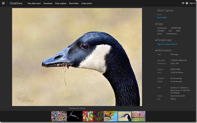
The surround was a pleasant black, there was an information panel at the right and a line of thumbnails of other pictures in the album at the bottom. You could click the image to present it in a nice “light box” view – just the image, nice and large.
Today that changed. Now you are taken directly to a light box view. The panel on the right is gone, but the information can be brought up as an overlay. Try it here:
Click the image to be taken to my OneDrive album “Silver Canvas” with this image in a large light box view.
When you move the pointer into the window, links and other information will surround the image. In the lower right corner there is an “i-link” – see the red arrow in the illustration here.
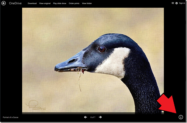
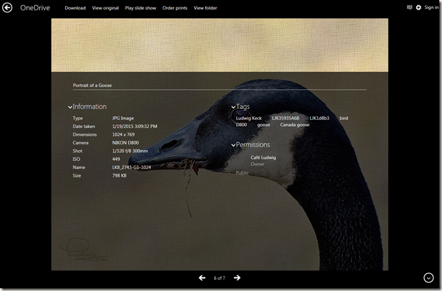
Click the “information” icon and the data for the picture will be displayed.
Slide shows go full screen, not just full browser window, but full monitor. That is very nice. NOTE: The images in my blog posts are scaled to 1024px so you will not get the full effect on a high resolution monitor.
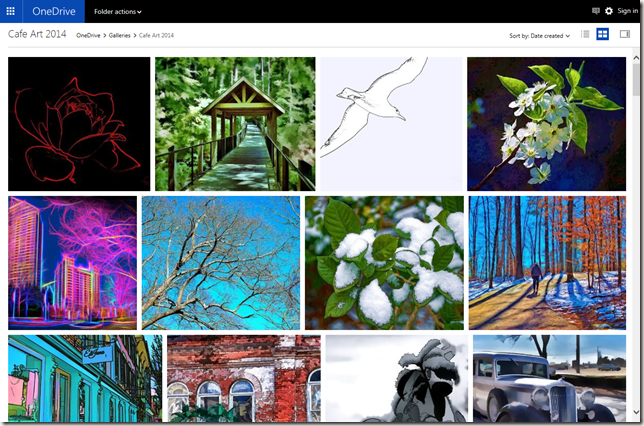
This change affects not only this and new posts, but works just as beautifully for all earlier posts. You can see the whole album by clicking “View folder” in the top menu bar. The pictures are nicely arranged in their correct proportions.
But Wait, there’s more! Hold down the Ctrl key and roll your mouse wheel. The display scales as you would expect in a browser window, but here the thumbnails are scaled and rearranged to fit the browser window. Really, really nice!

One very nice improvement in the development of OneDrive.
Thank you friends at Microsoft!
.:.
© 2015 Ludwig Keck




Reblogged this on This 'n That.
I use Flickr in same manner as you use OneDrive. I have never used OneDrive, although my husband keeps encouraging it. I may give it a look-see sometime in the future. My main goal in the next little while will be to set up a new PC (arrival set for Thursday!) and learn Windows 8. I had planned to wait until WIN 10 was released before purchasing new computer, but a good deal came along and was made sweeter with MS giving WIN 10 free to those who owned WIN 7 and WIN 8. I also purchased a Drobo and plan to begin using Ligjtroom in my photo editing workflow…lots of learning going on here 🙂
Thank you Linda!
I have been working on a post about photos in Windows 10. There were some things that were sub-par, shall we say, so I wanted to wait for the latest update. Still running some tests. Good luck in getting up to speed with your new computer!